Aimless
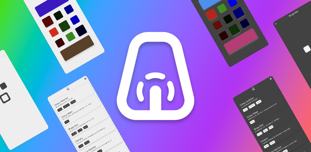
A fidget app with no real goal other than providing simple short-form things to do

What is this app?
A fidget app I created to make use of a bunch of code prototypes I have created for other projects. Starting projects is easy and I have started making multiple apps without ever really finishing them. As a result I have a load of useful bits of code for a variety of tasks so I decided to try and make use of them in a way that they don’t necessarily need to be cohesive.
Colour Switcher
This was the first screen that was created. I had been experimenting a lot with colour animations and found it very satisfying to see the items smoothly disappear into the background as the colour shifted to match and the shadow of the buttons vanished.
Colour Matcher
This screen went through a number of iterations. The basic idea was to present a “target” colour and have the user attempt to recreate it using some provided control. The earlier attempts included providing 9 buttons where 1 matched the background but this proved too easy because you could plainly see the closest match. I also tried using RGB sliders but it was too difficult from both the user perspective having too much choice and from my developer perspective trying to codify allowances for how close the sliders needed to be.
The final version which I’m happy with provides 3 reds, 3 greens, and 3 blues where the user simply needs to select the correct combination to form the target.
Shape Slot
Another screen that had a number of iterations that didn’t quite feel correct. I had initially wanted to use haptic feedback to make it feel like the user was touching objects on the screen so it would vibrate when you were touching objects on the screen and be still otherwise. However the reality is that you felt the feedback in the wrong hand since the hand holding the phone would feel it instead of the finger touching the screen.
The touch gestures though were useful in allowing the user to move objects around the screen so instead of the movement being the feedback it became feedback for completing the simple objective of moving the shape to its slot.
Colour Filters
Building on both colours and gestures we see these colour filters where they interact with each other as the user moves them around. Mixing colours in code is not the same as mixing things like ink or paint where the pigment changes. Instead we have blending modes that serve particular purposes such as “clear” when we want to erase pixels for cutouts in images. However in this case it uses a “difference” blend mode so it can continually stack and provide fairly different colours depending on the order.
Clickers
Really simple usage of animations for clicking buttons. Buttons that share the same colour as the background can be highlighted as being interactive by simply giving it “elevation” so it appears higher and casts a shadow. When the button is clicked it lowers until eventually there is no shadow and the button appears to vanish.
Having the buttons refuse to stay down and pop back up after only a second leads to this frantic need to see all of the buttons pressed at once and it is definitely possible to have all 12 pressed at once!
Colour Mixer
In another project I had been working on I started to learn a bit more about HSV colours so I could build my own customised colour pickers. This is putting those bits of knowledge to the test allowing the user to construct colours with different colour systems. Most people will recognise what the RGB mode is doing mixing red, green, and blue. Most people have used a HSV picker without realising what it does because it makes more sense when presented in a more appropriate set of controls. CMYK is the odd one out here and I wanted to include it just because it closely resembles how colours mix in the real world and is the scheme used by printers when mixing ink.
An example of a HSV picker


